C-View - Logistics App
C-View was a shipment visibility application where I was responsible for the UI/UX design. The goal of the project was to create a new web-based application for the logistics customers that was built on a modern framework, and that also allowed them to get accurate information as quickly as possible.

Early Designs/Wireframes
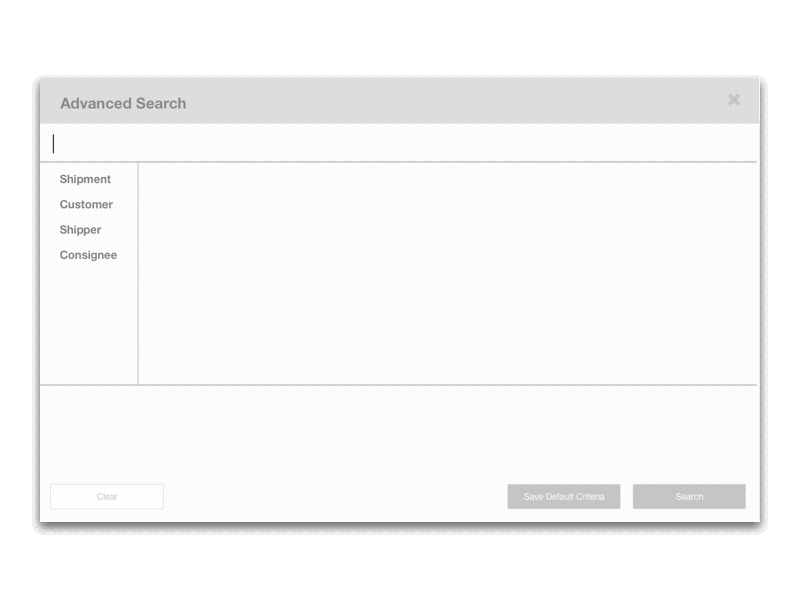
The early wireframes of the app followed a basic left nav structure, and used a 12 column style grid for the main content area. The main dashboard was very primitive for v1, but would still provide a high level overview of things like delayed shipments and potentially delayed shipments. I also created wireframes for some of the main features such as the advanced search and table column customization.

As the project moved into the UI design phase, I worked heavily with the Front-end devs in regards to the technology and frameworks that we would likely be using for the app. We knew the front-end would be built on angular, but we also knew we wanted to utilize some sort of UI framework library to cut down on initial development time.
We also also researched capabilities and limitations of the angular data-visualization libraries we could potentially use, which is incredibly helpful to make sure I designed something we could actually build within scope. Once I had a good understanding of some of the technical requirements, I created a basic color scheme to use with the angular them and began the high fidelity mockups.

UI Design
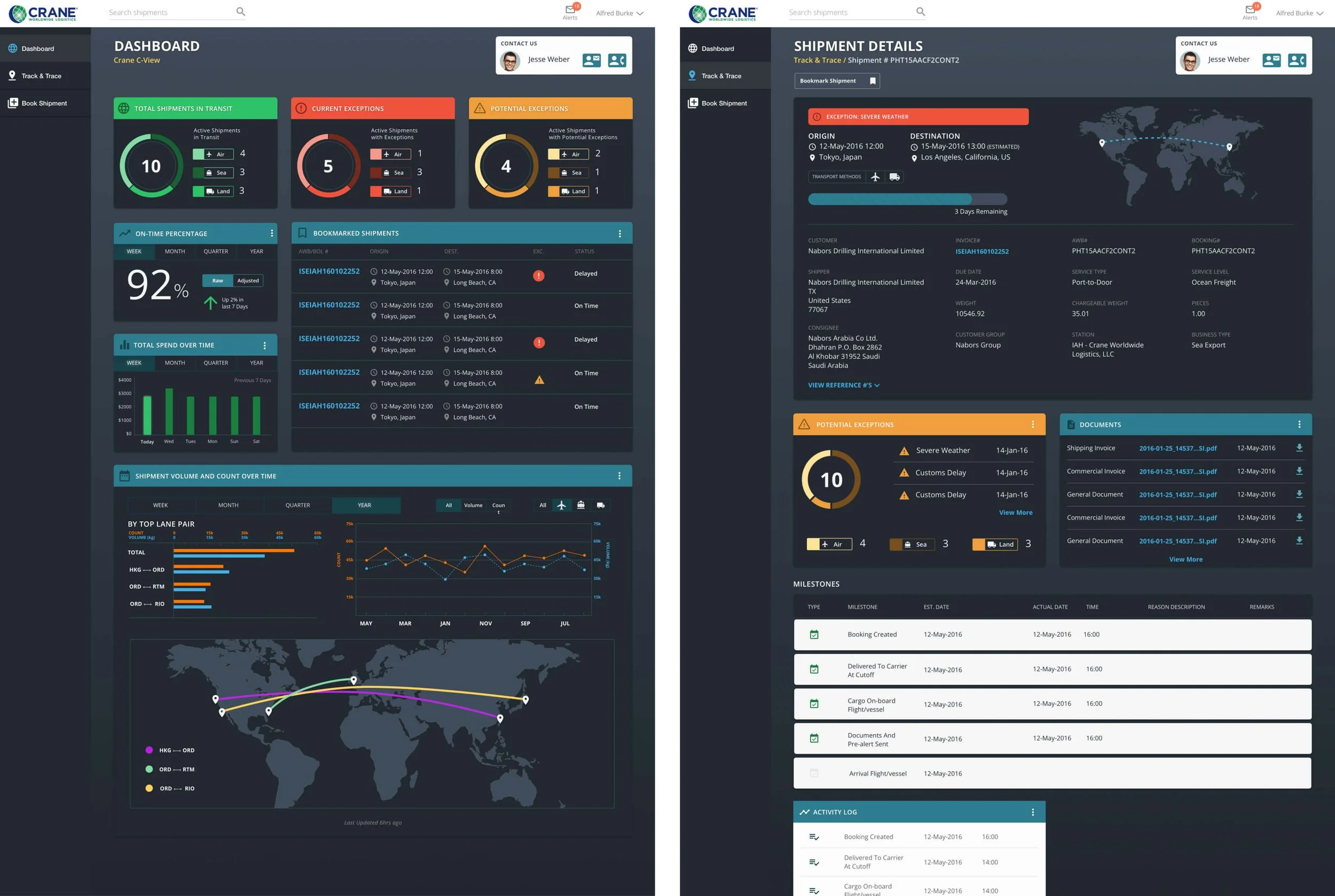
Early on in the visual design process I knew I wanted to go with a mostly dark UI to help separate itself from the overload of white and grays that are usually found in similar applications. While this is great for visualizations, text heavy content readability can suffer with darker UI.
I ended up creating a somewhat hybrid style that used the lighter UI elements for things like tables and data heavy components, while allowing the visual based components to utilize the dark interface.
Post-Launch Features
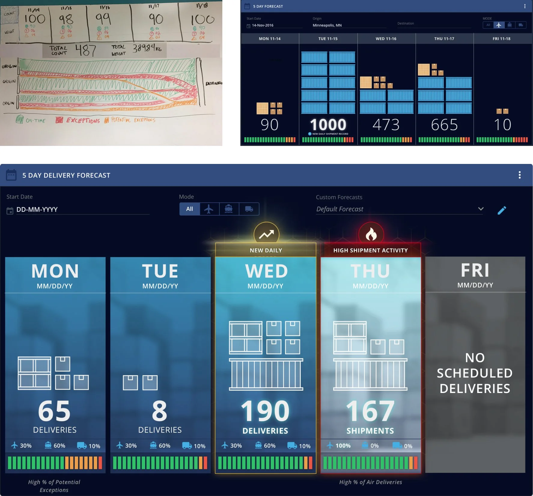
5-Day Forecast
The 5-day delivery forecast came from the desire for shippers ability to get a day by day breakdown of what was being delivered. This data can help roles like warehouse managers to better allocate staff and equipment to account for changes in volume.
The initial concept that was created on a whiteboard was very chart driven, but did not do a great job of relaying data/information quickly. After some discussion and revisions, it evolved to scale-based visualization that used custom icons to signify shipment volume amounts.
The final version included some additional visual improvements, including the addition of badges to bring a level of gamification to the application.

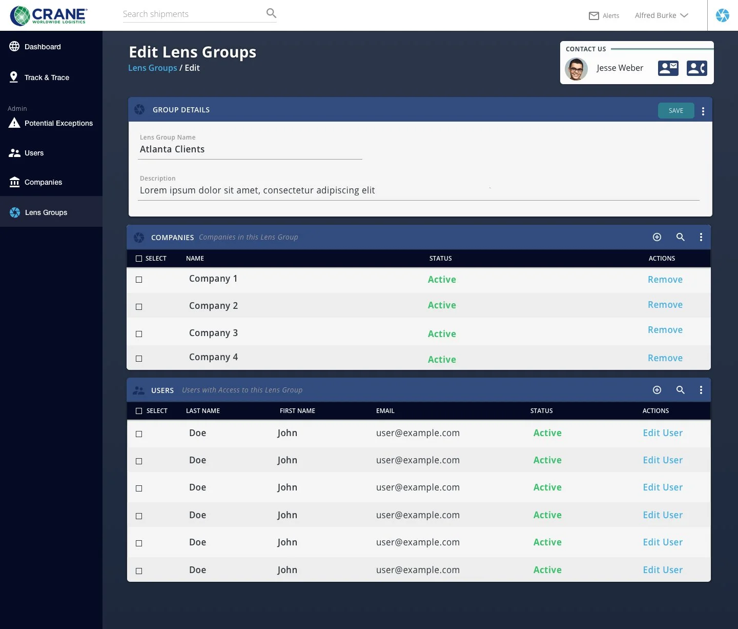
Lens Feature
The lens feature was a solution to a common request on the carrier/admin side of the application. Carriers often needed the ability to view data as a customer to troubleshoot issues, but the only way to do so was to have accounts created for each customer which is labor intensive.
The Lens feature allowed the creation of custom groups and permissions to allow admin users to easy switch between customer data sets.
Advanced Search Concept
Search functionality was always something that I wanted to improve in the application. The advanced search was a heavily used feature, but the amount of input fields and options made it overwhelming.
My idea for potentially improving the information overload was to create a query-builder style search, similar to how you can create an advanced query search in Jira. To do this, I went through all of the possible search options and organized them into categories, and created an intuitive UI to build complex detailed search.